EdenLife
A living identity system for a modern lifestyle service.
My role
At Dá Design Studio, I worked on EdenLife’s identity as a Brand and Production Designer. I worked with Seyi Olusanya, Johnson Ayodele, Tobi Afolabi, Dami Marcus, and Oiza Jagun.
We set the strategy and identity direction as a team. I helped shape the visual system and produced applications across the website, service photography, social media, packaging, merchandise, and campaigns.
Goals
Business goal
- We want a cohesive identity that's sexy and compelling (visually/verbally).
- We want to evoke a movement.
- We want our brand to be so dominating that our market position is impenetrably defensible.
Business problem
Mental barrier / cultural orientation of Nigerians/Africans. Except for food, home services are generally not seen as cool or sexy. Common employment of unskilled, cheap labour (house helps).
Customer goal
To have all their chores and mundane tasks taken care of so they can focus on living.
Customer problem
- Finding trustworthy service providers.
- Unreliable customer service and delivery.
- Zero quality assurance.
- All the time spent on mundane tasks and chores is reducing their productivity.
The brief was not only to make home services look better. EdenLife needed a clear lifestyle position and one identity for its connected services.
Brand Audit
A look at the old visual landscape — a visual asset map, logo comparison, and an audit of the verbal assets — distilled into the key takeaways that set up the refresh.
The audit showed a gap between EdenLife’s promise and its visual language. It gave us a clear basis for the refresh.
Direction
The team used the concept Optimising life for winners to shift the focus from chores to the life around them. It became our filter for an identity that felt confident, useful, and full of movement.
Identity system
Palette and typography
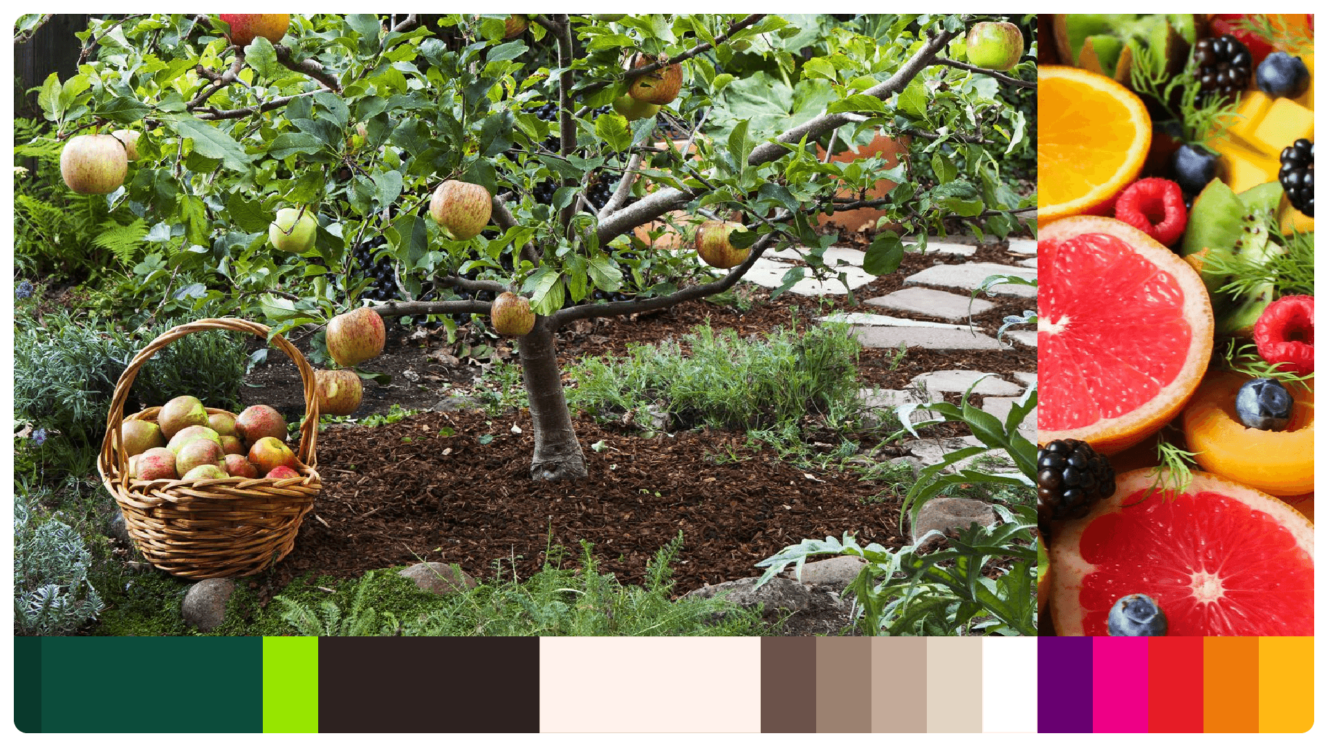
The palette pairs a calm, grounding green with fresh accent colours. The primary colours anchor the service. Secondary colours give campaigns, illustrations, and information more range.
We chose Jubilat for its confidence and the way its forms echo fruit and tree stems. Simula adds a lighter voice. Cerebri Sans keeps longer text friendly and legible at small sizes.
Checkmark
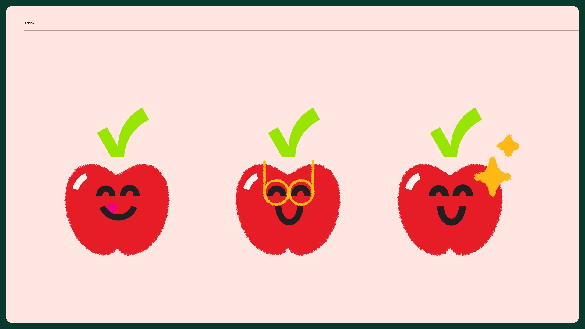
The checkmark anchors the logo and gives the motion system a simple, recognisable action.
Flourish
Flourish expresses growth as a force, not a decoration. Its shapes draw from flowers and waves, then expand through motion and layouts.
Icons and illustration
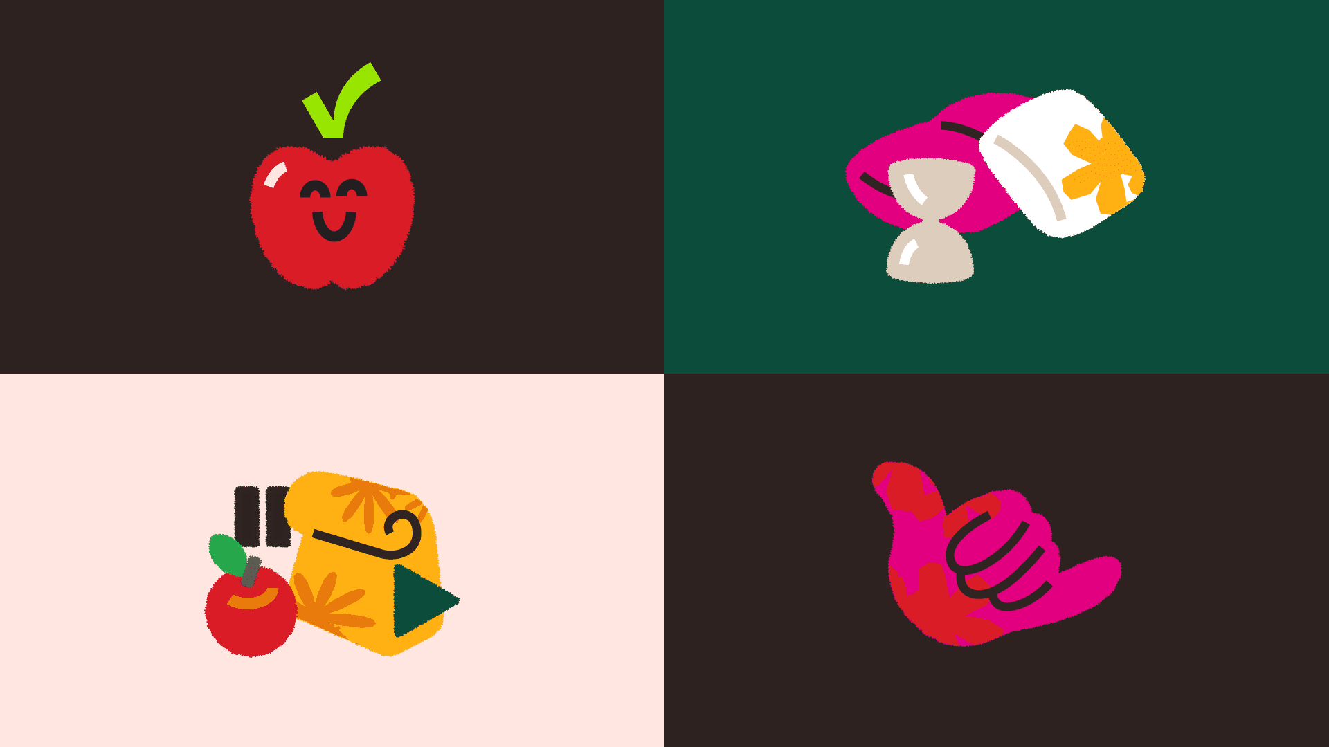
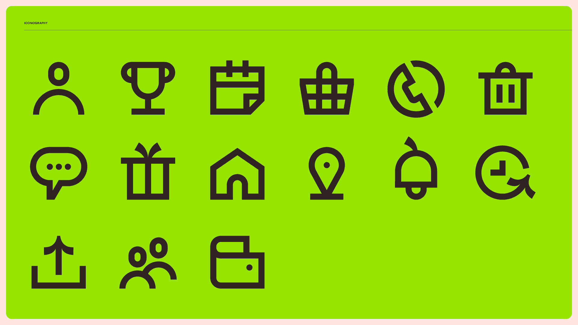
EdenLife’s icons take cues from Jubilat and the checkmark. The same curved, organic character continues through the illustration set and mascot.
Applications
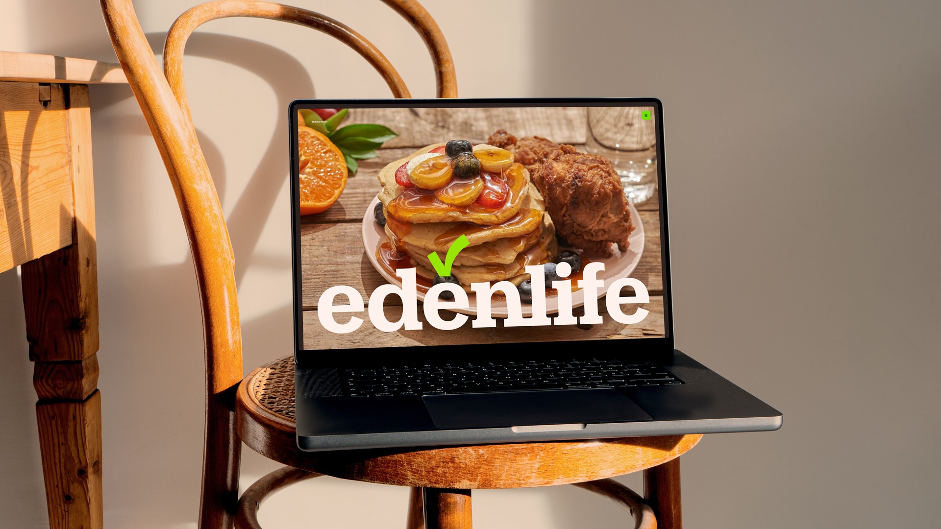
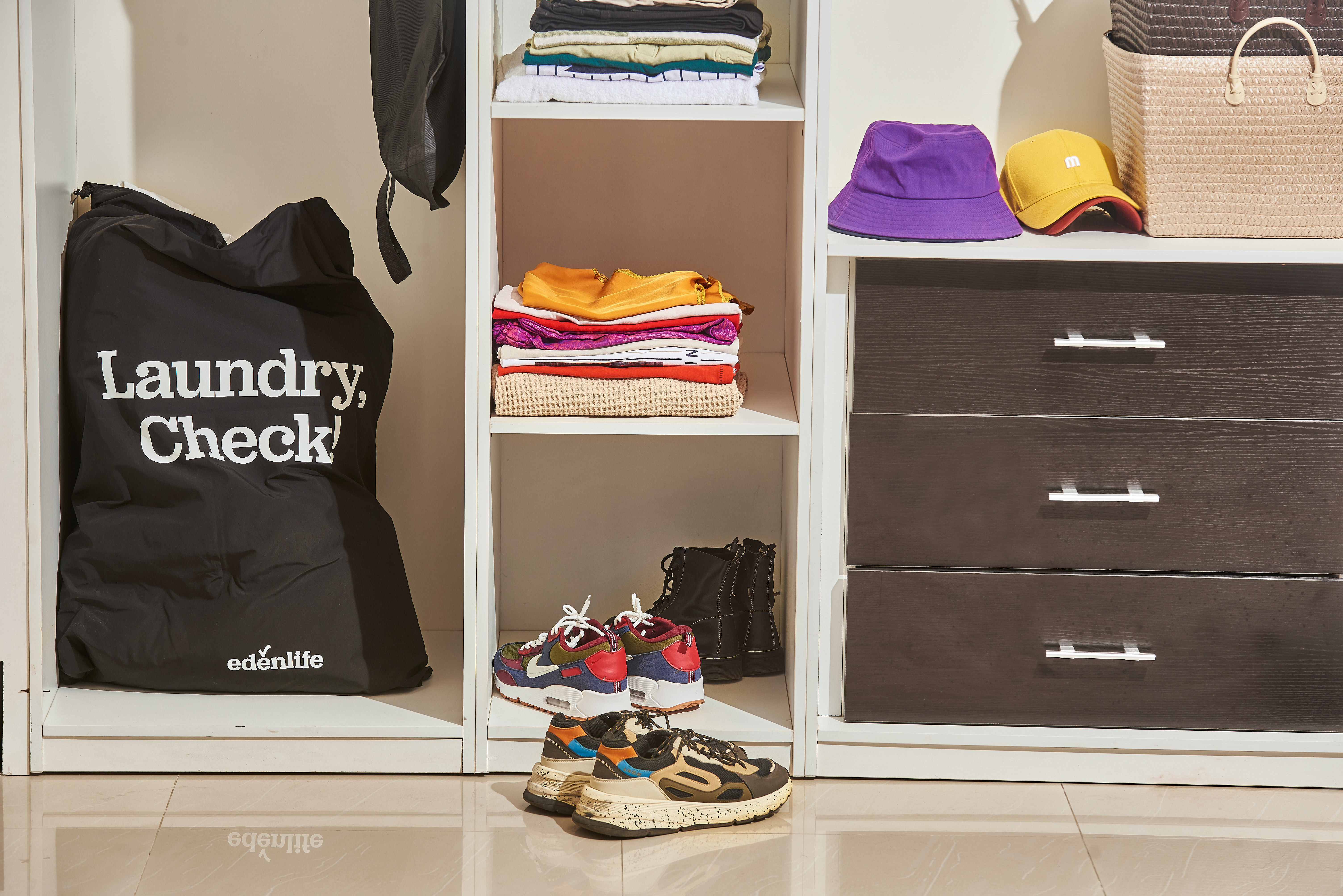
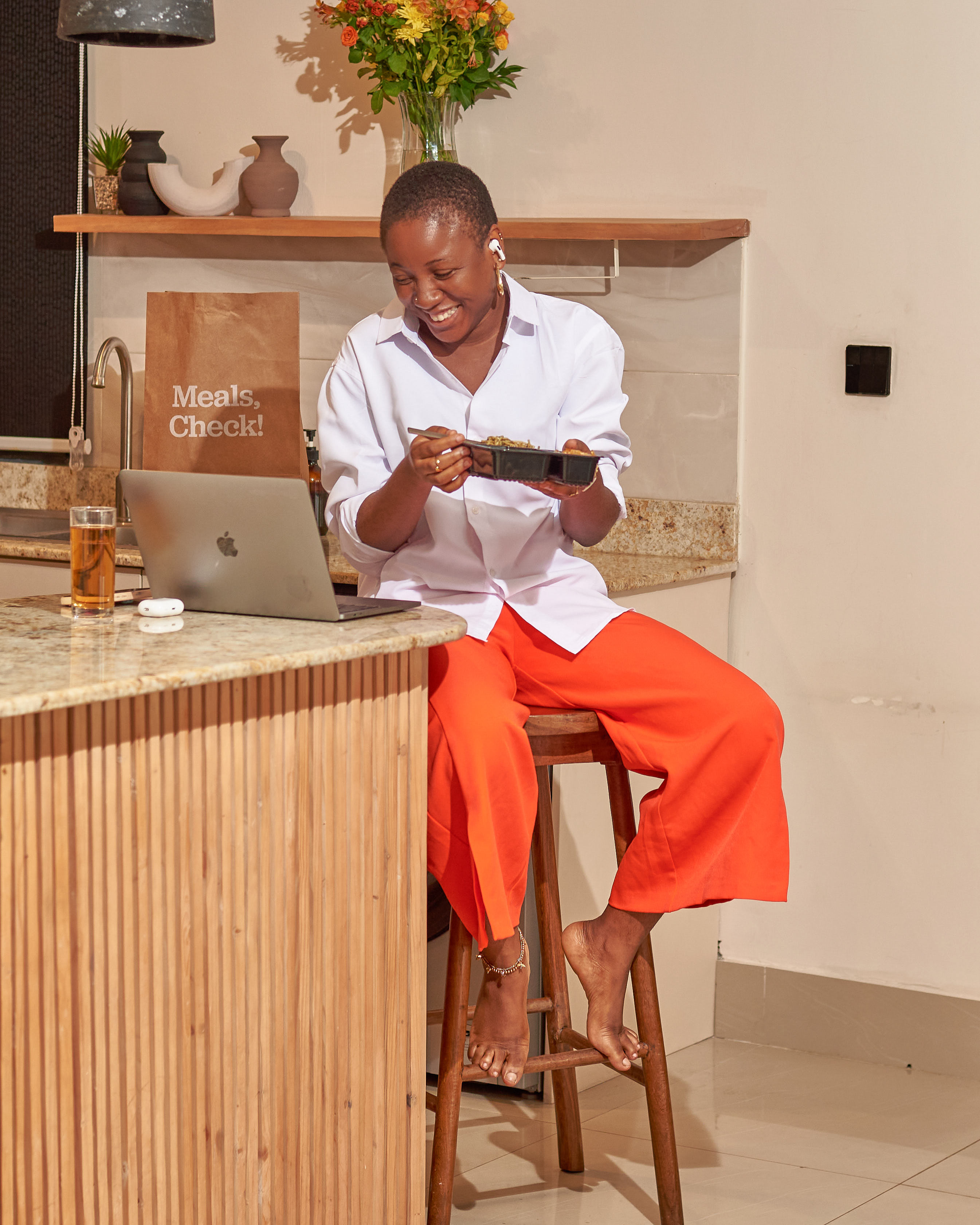
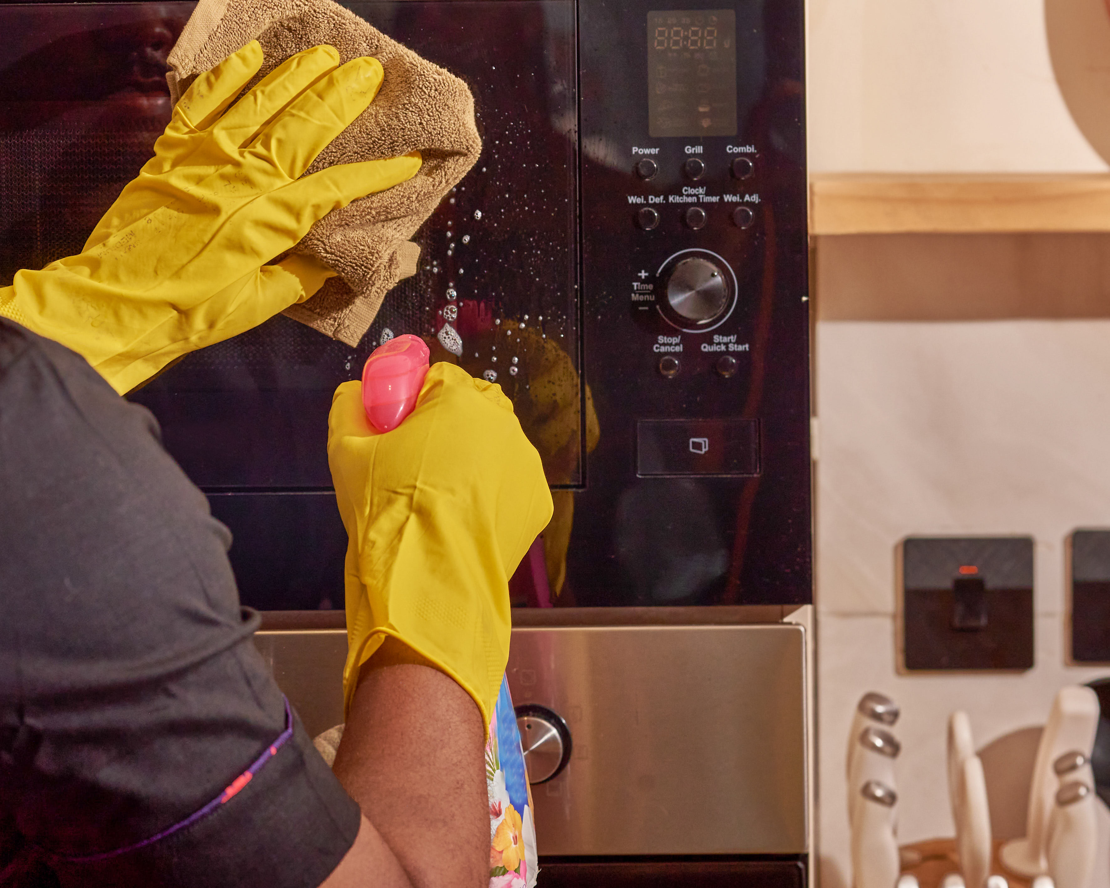
The identity had to work across a service business, not only in a brand guide. We produced it across digital screens, service photography, packaging, clothing, and campaigns.
Website and service photography
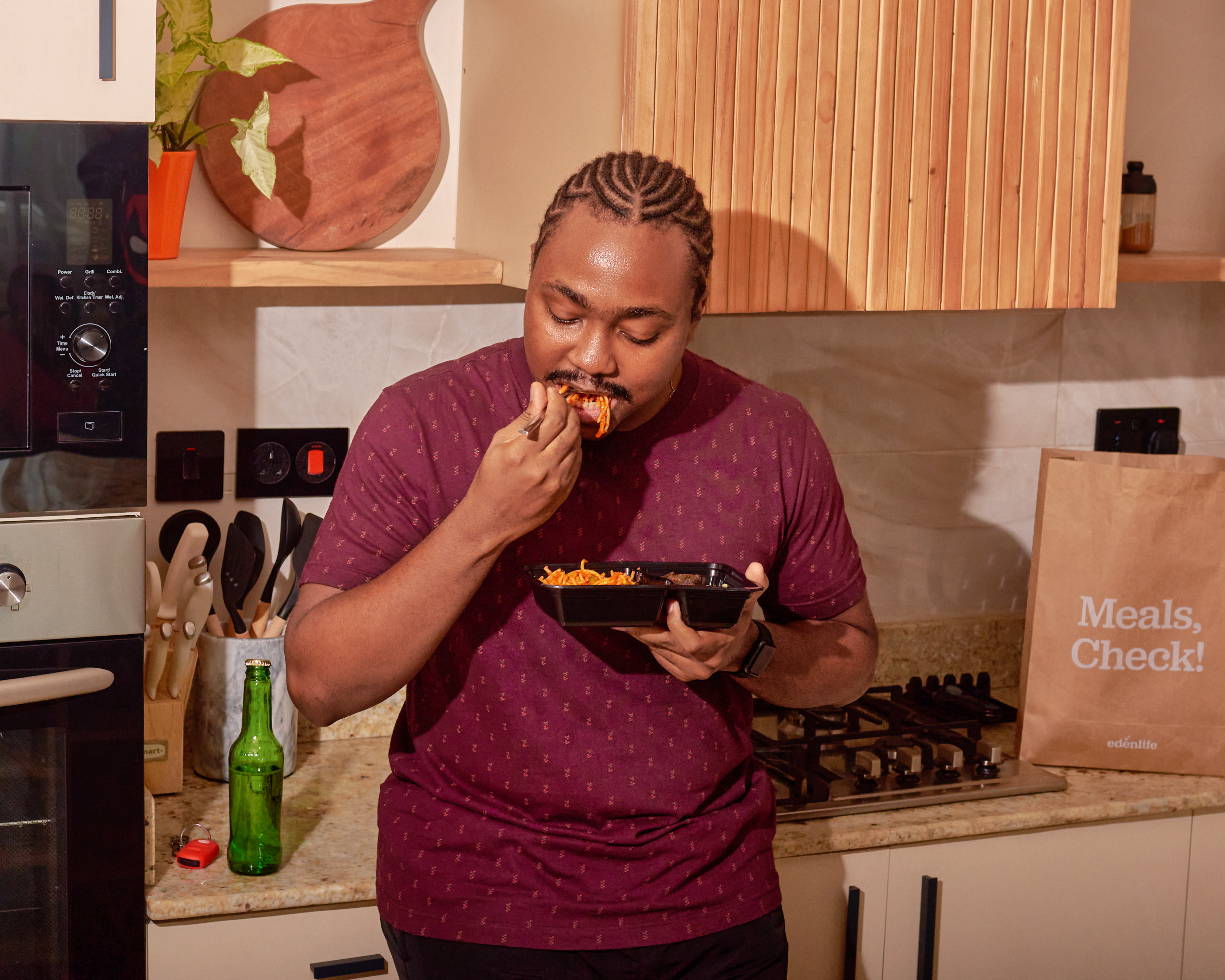
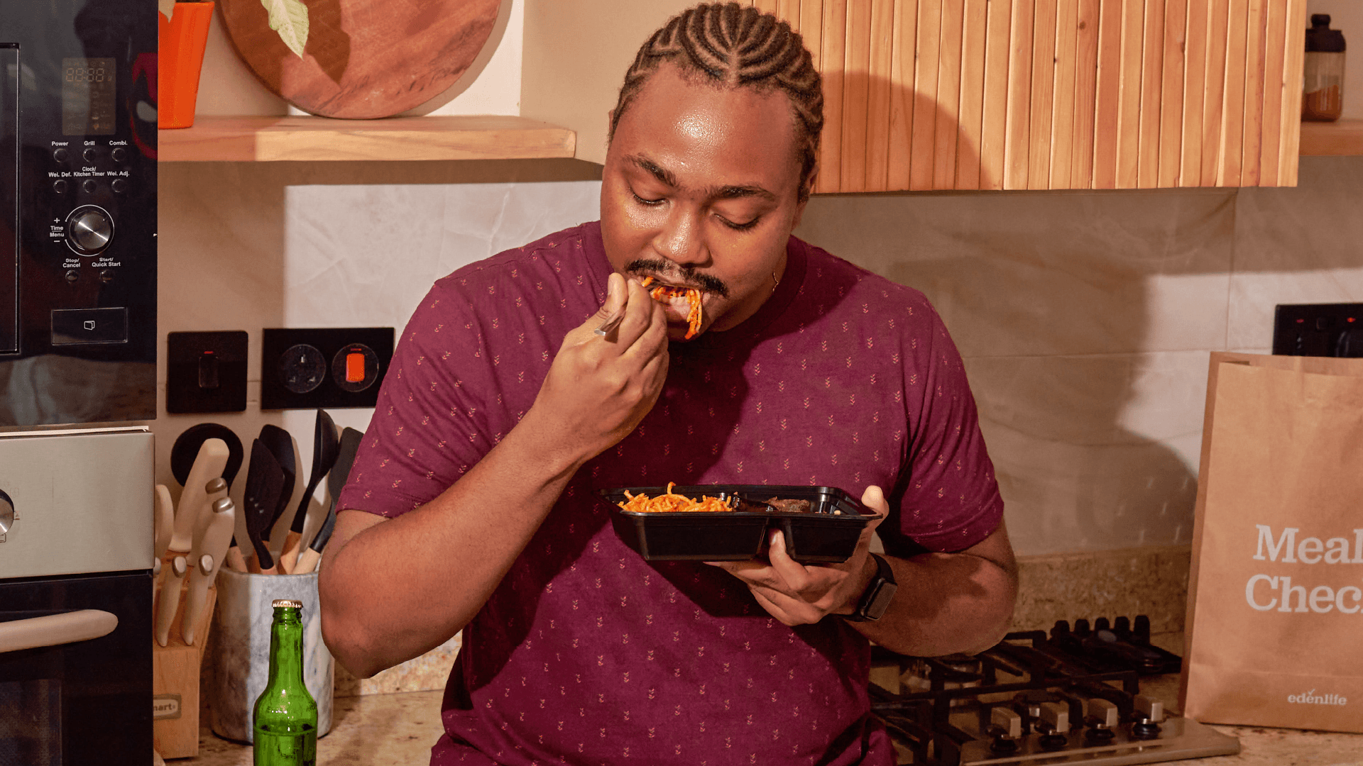
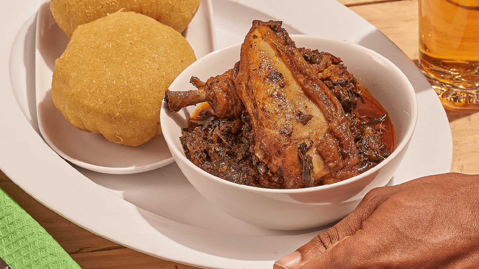
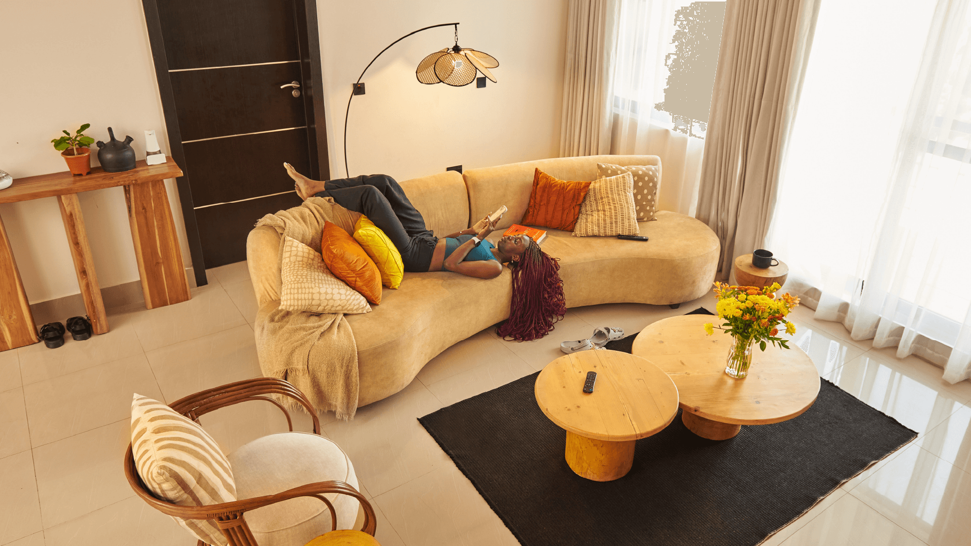
The website pairs direct service information with photographs of the people, spaces, meals, laundry, and cleaning that EdenLife brings together.

Social media
Social posts use the same type, colours, Flourish shapes, and service photography. The formats can change while EdenLife keeps a clear visual voice.
Packaging and service icons
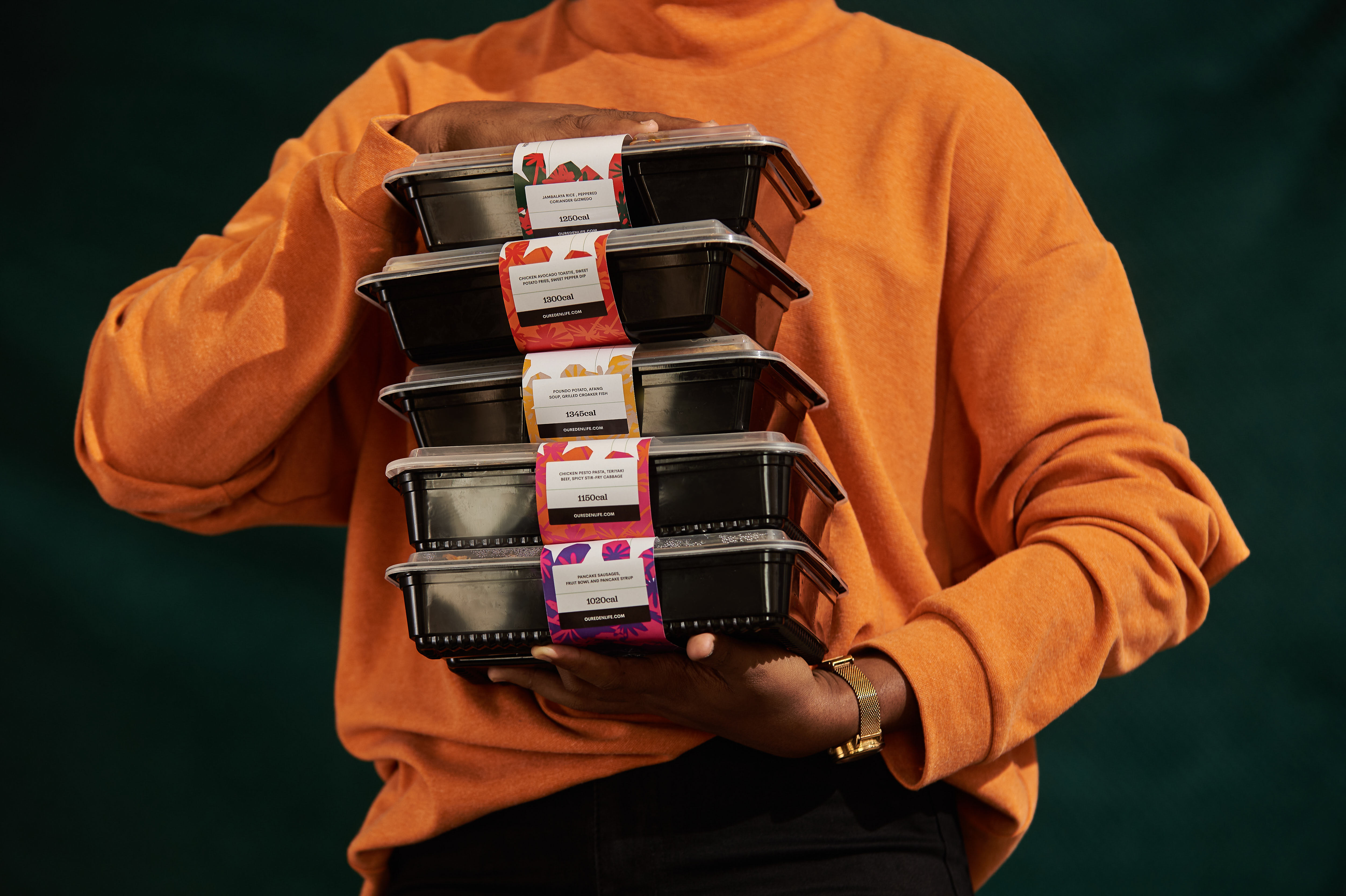
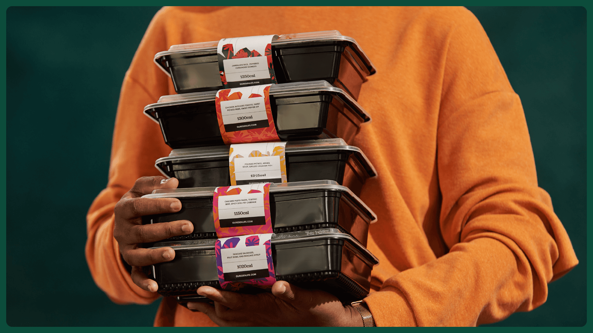
Meal packaging and service icons use the same palette and visual character. This keeps daily service touchpoints connected to the main identity.
Uniforms and merchandise
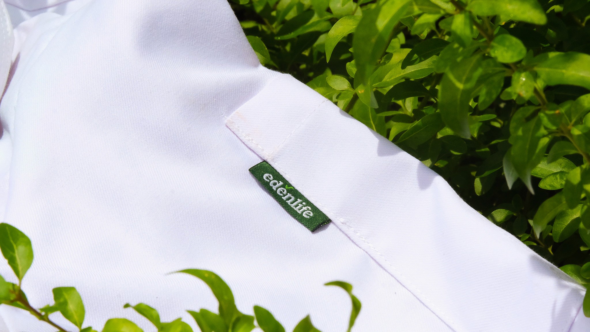
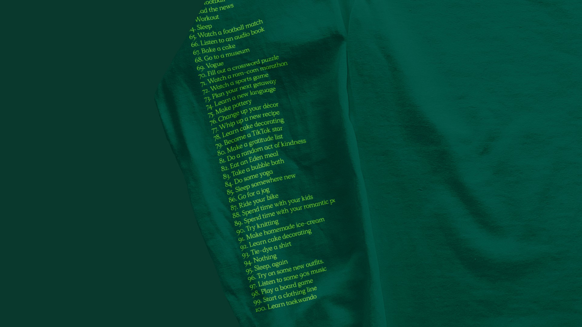
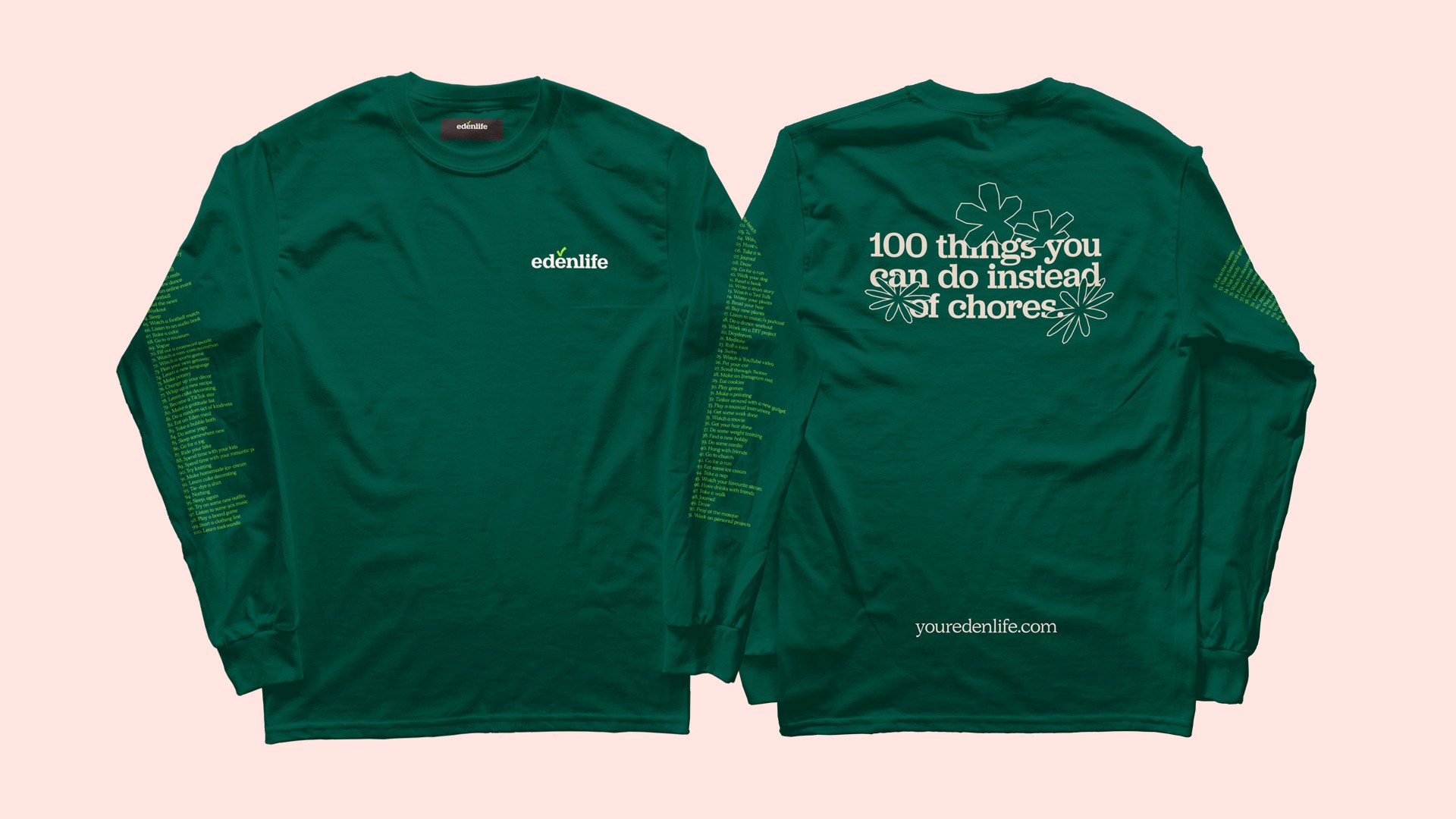
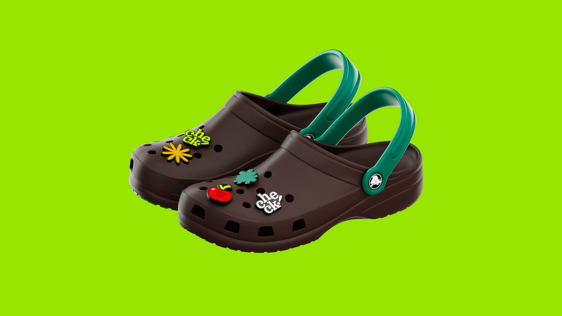
The identity also moves into uniforms and merchandise, from small garment labels to shirts and customised clogs.
Campaigns
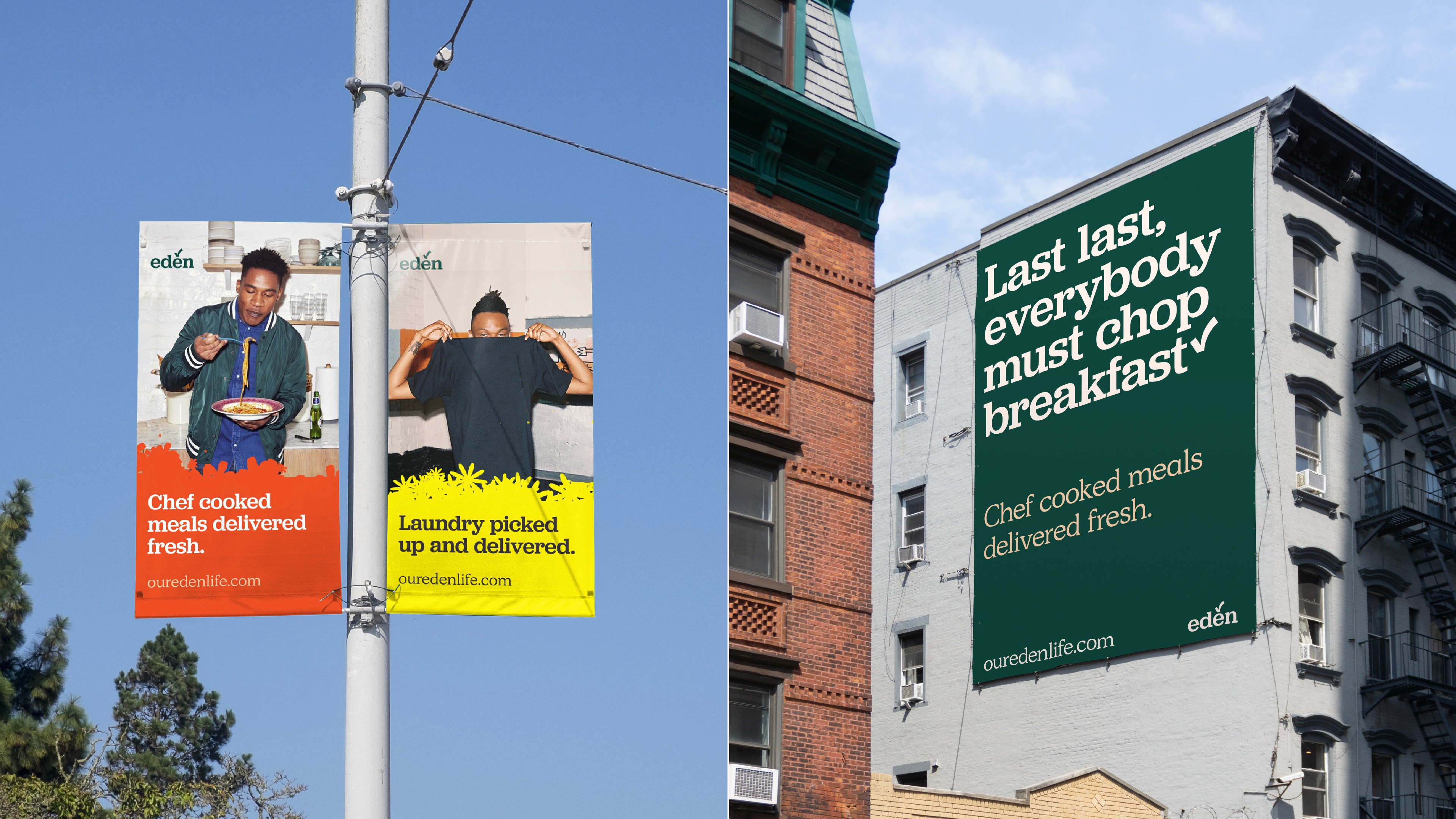
Campaign layouts combine the complete system: type, colour, Flourish, photography, and direct service messages.
Produced system
The identity was produced across EdenLife’s website, service photography, social posts, meal packaging, uniforms, merchandise, and outdoor campaigns. The same palette, typography, checkmark, icons, and Flourish connect each application without forcing it into one format.